Accessibility Compliance in Data Visualization
Project Summary
UX/UI Designer | Civitas Learning | Higher Education Software | Sketch | WCAG 2.1
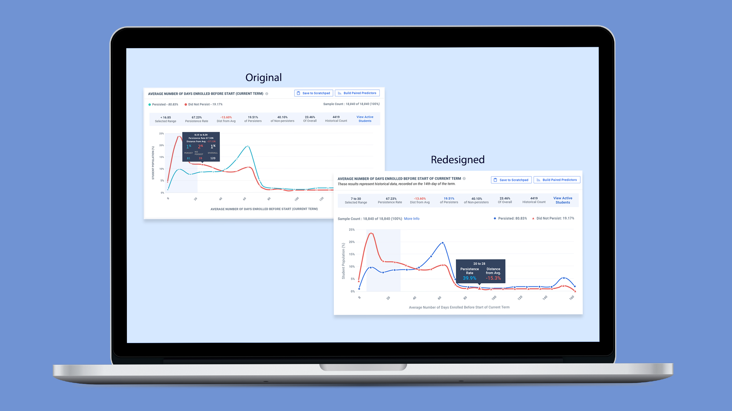
Problem to solve: The data visualization chart on the Illume product home page was not meeting current WCAG standards for accessibility, which was preventing sales to colleges and universities requiring “Section 8” compliance.
Solution: I evaluated each component of the chart individually, as well as the chart as a whole, to identify areas in which we could make improvements. Through my analysis, I discovered and corrected issues with the overall color palette, font sizes and colors, text styles, data lines, and data points.
In addition, there were components of the chart, such as the legend and sample count metrics, which were disconnected from the data they referred to in the chart, so I rearranged those for improved readability.
The data box that appeared when individual points were hovered over needed a redesign for color and content, as well, which required collaborating with the product manager to determine which data was the most valuable to our customers so it could be prioritized.
Impact: The redesigned chart was not only accessible visually, which eliminated the blocker for our sales reps, but the content was easier to digest because the information had been prioritized and organized in a more intuitive manner, so our customers would now have a better overall experience using the feature.